Three Ways to Add a Pop of Color (When Your Palette Looks a Little Boring)
Oct 14, 2026I taught my Your Color Style masterclass yesterday morning, and when I asked what everyone struggles with most, the chat filled up fast. A lot of it sounded like this:
“I’m too matchy-matchy. Not enough contrast.”
“Stuck in a rut, same colors every time.”
“I want color, but I hate when it looks too busy or clownish.”
“I’d just like to expand my palette.” “My palettes look boring.”
Do you hear the tension in there? You want more interest. You’re also afraid that “more” is going to tip over into “weird.” So you stay safe, and safe comes out a little flat, and you’re bored by your own quilts.
One of my favorite tricks in my belt for exactly this problem is the pop of color!
What a pop of color actually is
A pop of color is one color, used in small doses, on purpose.
You start with a typical palette, maybe it is one that’s mostly one color (monochromatic) or a few neighboring colors (analogous). To keep it interesting, you vary the lights and darks within that palette. Then you add one more color, in little bits, spread fairly evenly across the quilt. One piece in each bird. A few small patches scattered through a skyline.
That’s it. And the reason it fixes “matchy-matchy” is not that you added more colors. It’s that you added one, in small amounts, and you chose it deliberately.
The question, of course, is which one. Here are the three color pop options!
1. The Harmonious Pop
This is the most subtle pop of all.
A harmonious pop is a color that sits near the rest of your palette on the color wheel. Colors that are neighbors on the wheel share something in common (green contains blue, so green and blue get along), which means the pop will feel like it belongs. It adds interest without any jolt.
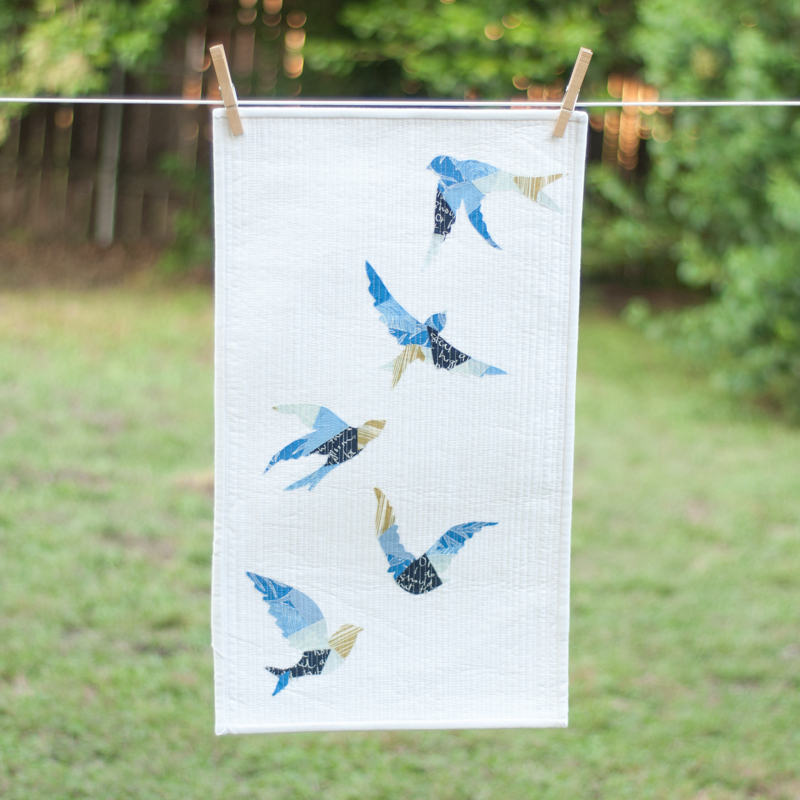
For my flock of birds quilt, I started with blues, lights and darks, and then chose a color near blue on the wheel: a chartreuse green. There’s just one little piece of chartreuse in each bird. That’s all it took.
Some other harmonious pops I love: aquas with pops of gold. Pinks with pops of orange. Mints with pops of medium and dark gold. Reddish oranges with pops of pink.
If you want your quilt to stay calm and quiet and just feel a little more alive, this is your pop.
2. The Contrasting Pop
This pop is even poppier!
A contrasting pop is a color from across the color wheel, opposite or nearly opposite your palette. Colors that sit opposite each other share nothing in common, and because of that, they make each other stand out. Pink looks most pink next to green. Blue looks most blue next to orange. So a contrasting pop really, truly pops.
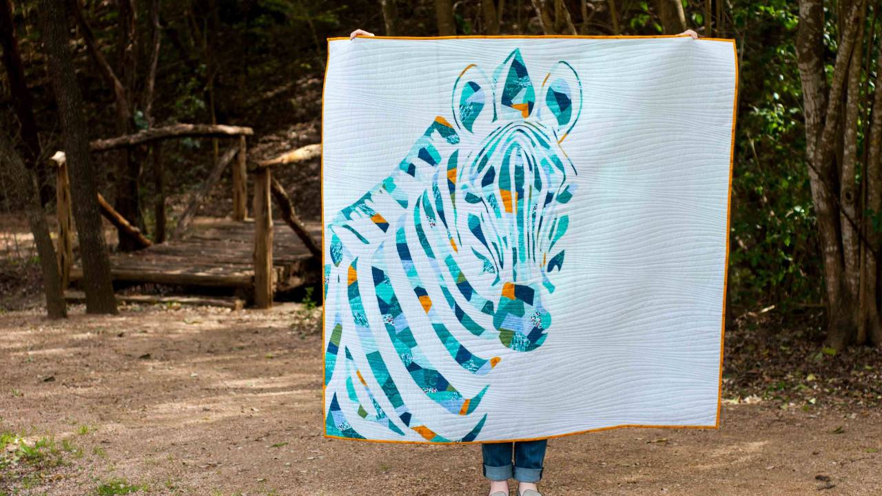
For my bear quilt I started with oranges, lights and darks, and then jumped across the wheel to mint green. Don’t get hung up on finding the exact opposite. Just jump across and pick a color you think looks good.
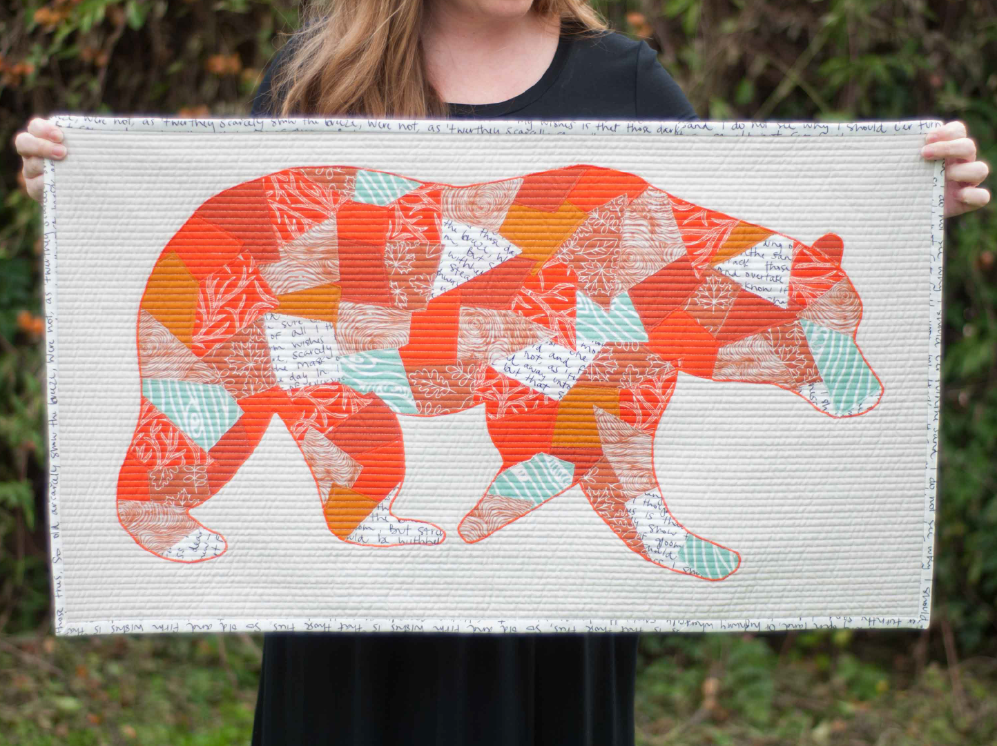
Here’s the lovely bonus of this one: you now automatically have both warm and cool colors in your quilt, and that alone makes it feel balanced and dynamic.
Some contrasting pops I love: rusty oranges with pops of mint. Blues and greens with tangerine. Greens and yellows with pops of purple.
If you want playful and a little surprising, this is your pop.
3. The Print Pop
This one is my favorite, because it’s sneaky.
The magic ingredient in the print pop is a multi-colored print that includes your main color, but also has other colors in it. The print blends with the rest of your palette because it shares your main color, and the other colors in it provide the pop. You don’t have to pick the pop at all. The fabric does it for you!
Say you’re making a mostly gold quilt. You pull your golds, lights and darks, tone-on-tones and blenders, maybe a solid. Then you find a print that has a lot of gold in it, and also greens and purples. Cut that print into small pieces and you won’t see flowers, you’ll see little bits of green and purple scattered through the gold. Pops!
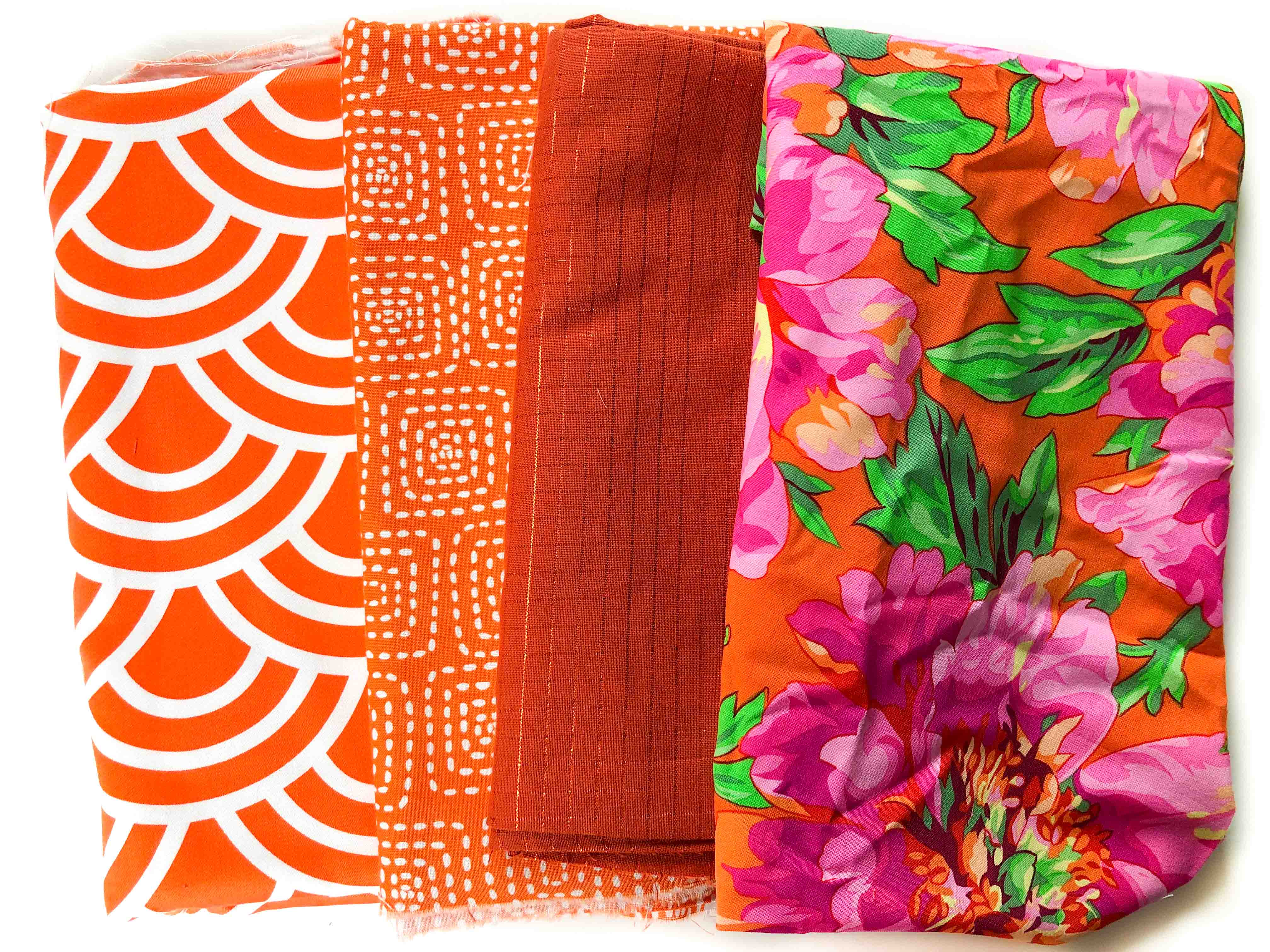
Large-scale, many-colored prints (Kaffe Fassett is my go-to) work beautifully here for exactly that reason. And less is more: one or two of these prints per quilt is usually plenty.
If you want the pop to feel like it just happened, like you have an effortless eye for this, this is your pop.
One small caveat
Whichever pop you choose, it should agree in tone with the rest of your palette. If your palette is soft and muted, pick a muted pop. If it’s bright and clear, pick a bright one. A clear, bright orange dropped into a dusty, muted pull will shout over everything, and that’s the “weird” you’ve been worried about. Same tone, different hue, and you’ll be fine.
Which pop is yours?
Here’s what I’d love for you to notice. Three quilters can use the exact same technique and come out with three completely different quilts. One of them wants calm. One wants playful. One wants it to look effortless.
That difference isn’t about skill. It’s your color style, and once you can name it, choices like this stop being agonizing and start being quick and fun!
This is just one small tool to add to your belt. We’re diving into more in my free live masterclass, Your Color Style. There are two sessions left! Bring a pen, some paper, and have your stash within reach.