
Hello {{first_name}},
Over the weekend, we celebrated our Art School for Makers virtual exhibition: 14 pieces by 12 artists, each offering a different glimpse into its maker’s world.
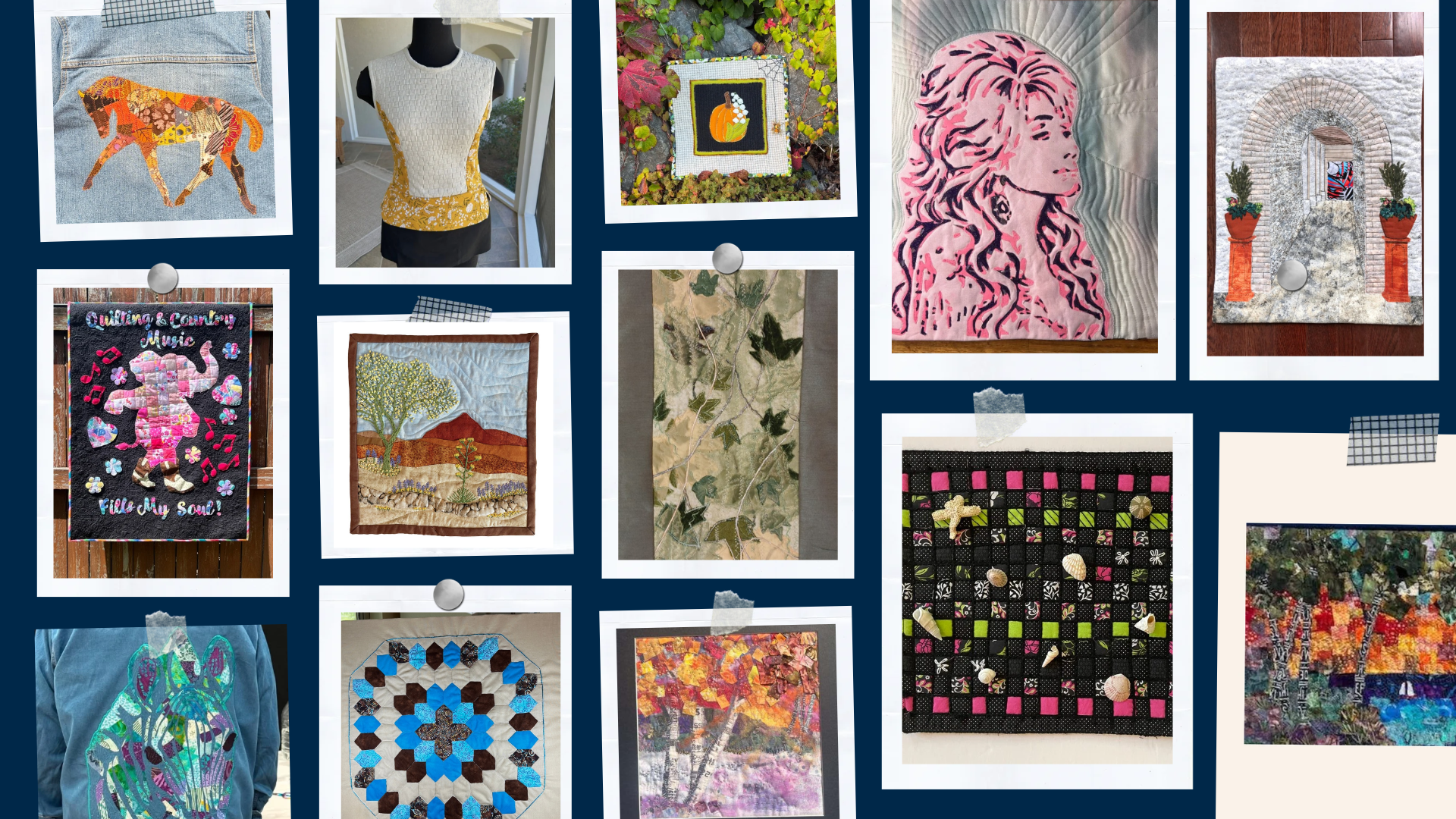
There were embroidered desert flowers, woven fabric, layered autumn landscapes, and art made to be worn. Seeing all that work together was such a joy. And hearing the artists talk about how they have grown made it even more meaningful.
Before the public exhibition, our makers gathered to share the stories behind their pieces. We talked about experiments, surprises, and the discoveries that are helping their work feel more like their own.
To our exhibiting artists: I am so proud of you. Thank you for your curiosity, your persistence, and your willingness to share what you make. It has been an honor to see where your ideas have taken you this year.
And thank you to everyone who joined us to celebrate them! Your presence and encouragement helped make the day special.
Whether you missed the event or would love another look, I hope you’ll spend a few minutes exploring the pieces and reading the artists’ statements.
There is so much to enjoy—and perhaps a little inspiration for whatever you’re curious to try next.

Responses