
Hi {{ first_name }},
At last week's live class, one question kept popping up in the chat in different words: how do I use bright colors without it looking like a crayon box exploded? Today's post is my favorite simple answer, with before-and-after photos so you can see it work.
And if you'd like more tips like this one, there's one more live Find Your Color Style class this Wednesday, October 21 at 1pm ET.

How do I use bright colors without my quilt looking like a crayon box exploded? Or, as someone else put it, without it looking like a kindergarten classroom?
Let me say this first: there is no right or wrong when it comes to colors (or art in general). If you love ALLLLL the brights at full volume, do it! If it looks good to your eye, go for it!
Who this article is for are those of you who want the vivacity of a bright quilt, but most of the times when you pull your own bright palette, it doesn’t look like those quilts you are in love with – it is just a little too much. When a bright quilt feels like “too much”, the trouble usually isn't the colors you picked. It's that every single one of them is turned all the way up.
When every color is shouting
Say you're making a quilt for your granddaughter, and you've let her pick the fabrics. (Of course you have– it’s so fun to get her in on the process.) She comes back with hot pink, electric purple, and the brightest turquoise in the shop. She is thrilled. You are squinting.
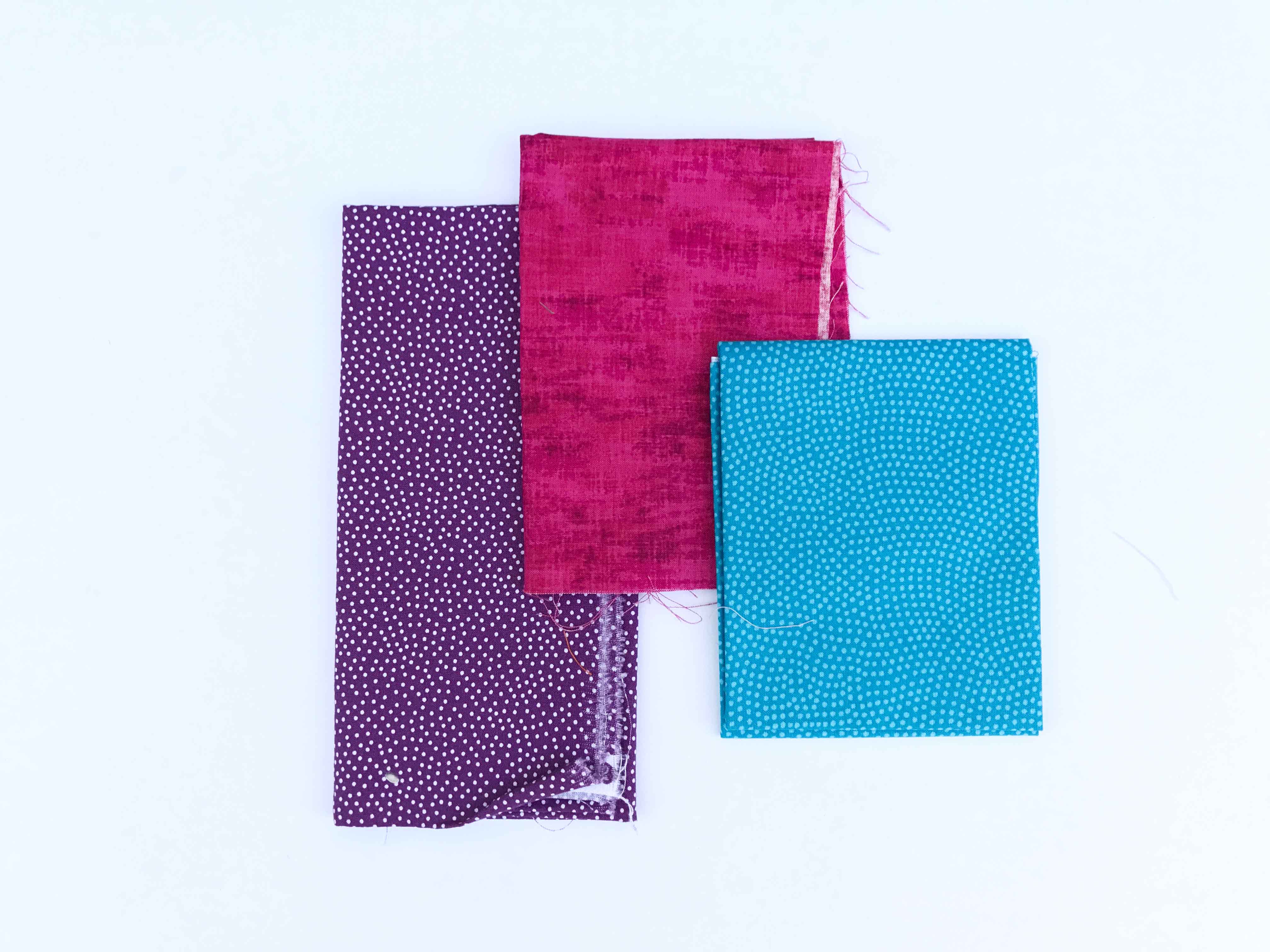
Now you have two small problems. First, you're going to be sewing these together for weeks, and they might give you a headache. Second, you'd love this quilt to grow up with her, so it still feels like hers at ten or fourteen and not only at age four. The good news is that you don't have to talk her out of a single fabric.
The fix: add the same colors, just paler.
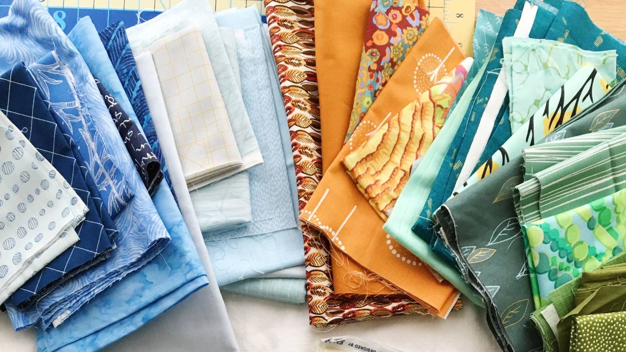
Keep her pink, her purple, and her turquoise. Then add a few more fabrics in those same colors, only paler and softer: a pale pink, a soft lilac, and a pale aqua or two.
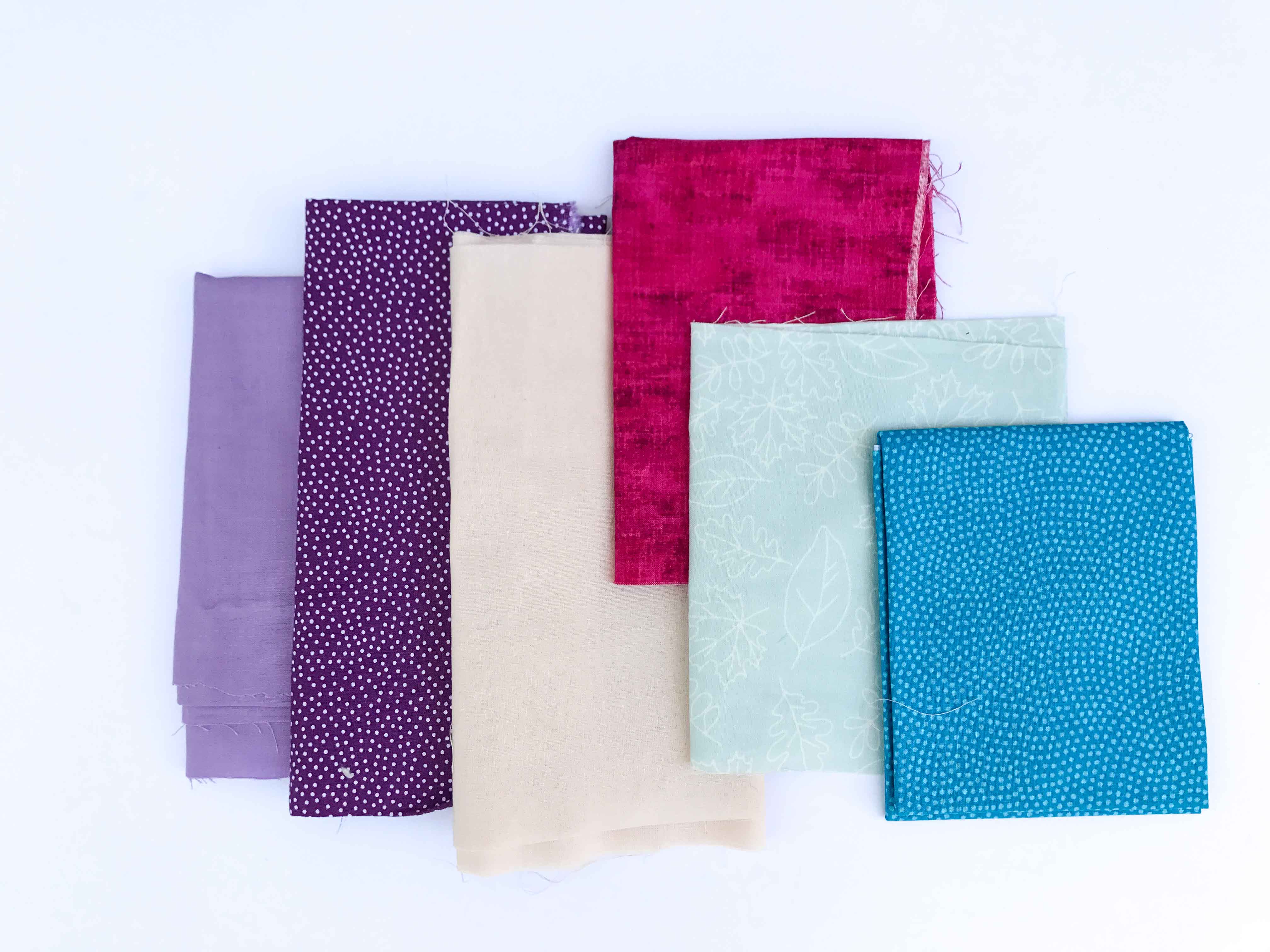
Look at what happens. The palette fills out. The brights still shine, but now there's somewhere for your eye to rest between them, so they read as sparkle instead of noise. The whole quilt grows up a little, too. It looks less like a kindergarten classroom and more like a girl with great taste. These are still exactly the colors she chose, and the quilt will grow with her.
Same trick, grown-up palette
This isn't only for kids' quilts.
Maybe you've pulled a stack of brights for yourself, and each one on its own makes your heart beat a little faster. Together on the table, though, it's a lot. It's more intense than you want to live with.
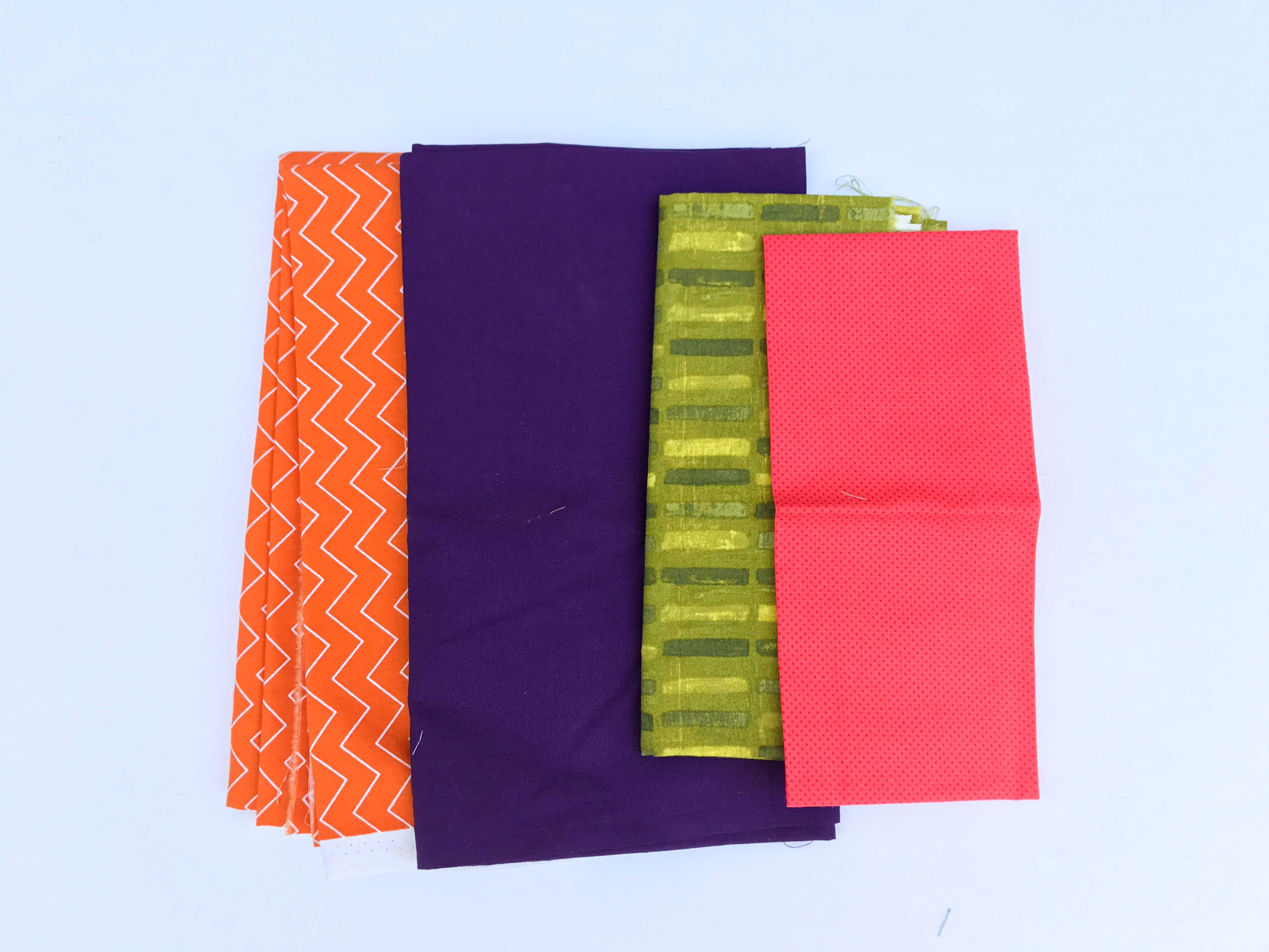
Again, there is no right or wrong with color – as it is this palette is vibrant and fun and may totally be your cup of tea, if so, keep it as is. If it’s a little much for your preferences, here’s what you do:
Use the same move. Swap out a couple of those fabrics, or add a few, in the same colors but paler and softer.
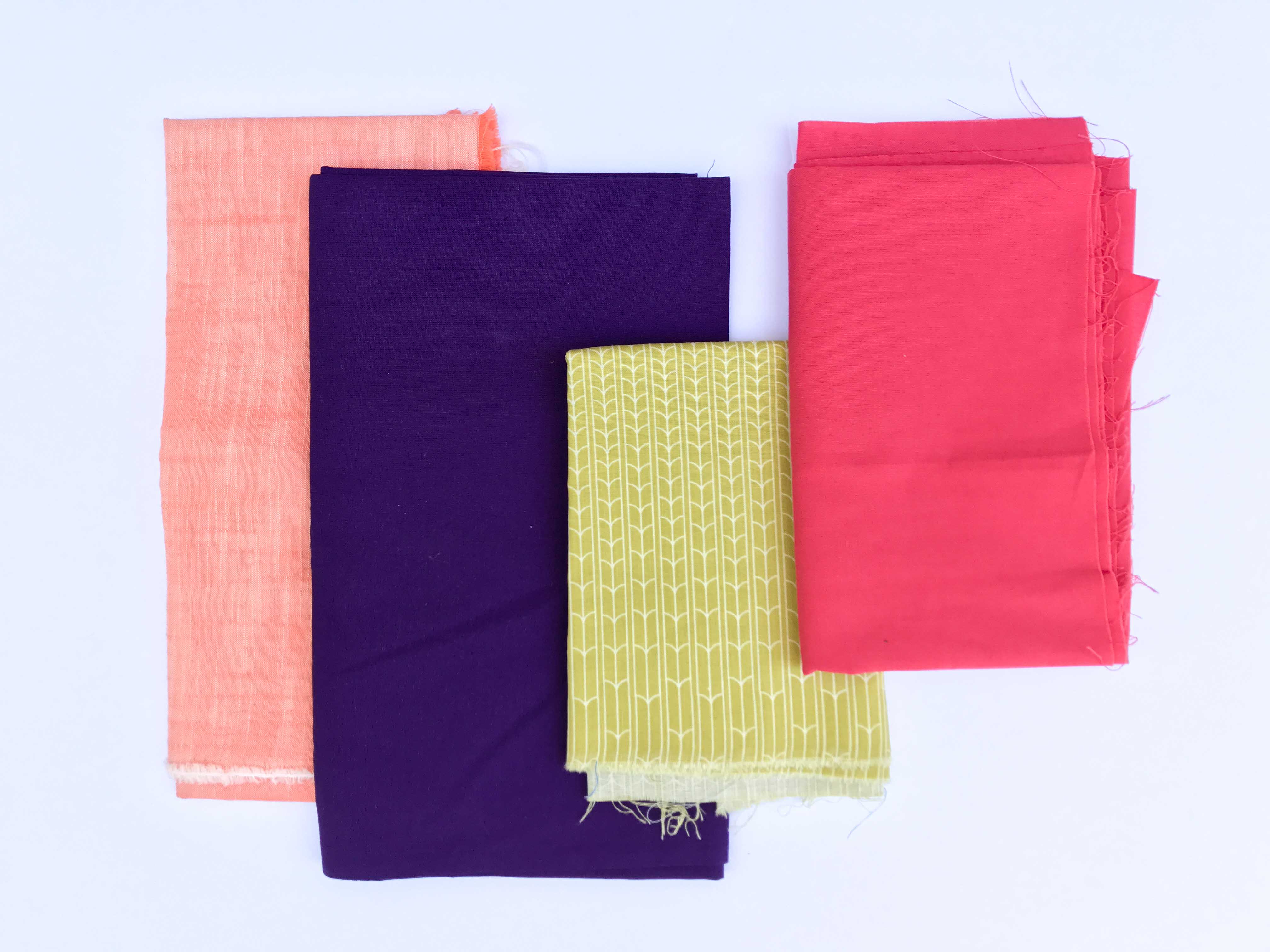
An otherwise very intense palette softens almost automatically, and you didn't have to give up a single color you love.
That's the whole trick. When your brights feel like too much, don't change the colors. Add or swap in softer, paler versions of them.
The dial underneath the tip
Notice what the fix actually was. We didn't add new colors. We nudged how intense or soft the palette is overall.
That's one of the dials in your Color Style. Some of us love the volume turned all the way up, and some of us love it soft. A lot of us live somewhere in between and never realized it was a choice. Once you know where your dial naturally sits, you stop wondering why a pull feels off, and you know which way to nudge it.
That's exactly what we do together in Your Color Style, and there's one more live class this week. You'll hear more tips like this one, play with color alongside me, and leave with your own color style named in a single sentence!
Wednesday, October 21 at 1pm ET. It's free.

If you can't make it live, register anyway and the replay will come to you.
Bring your brights!
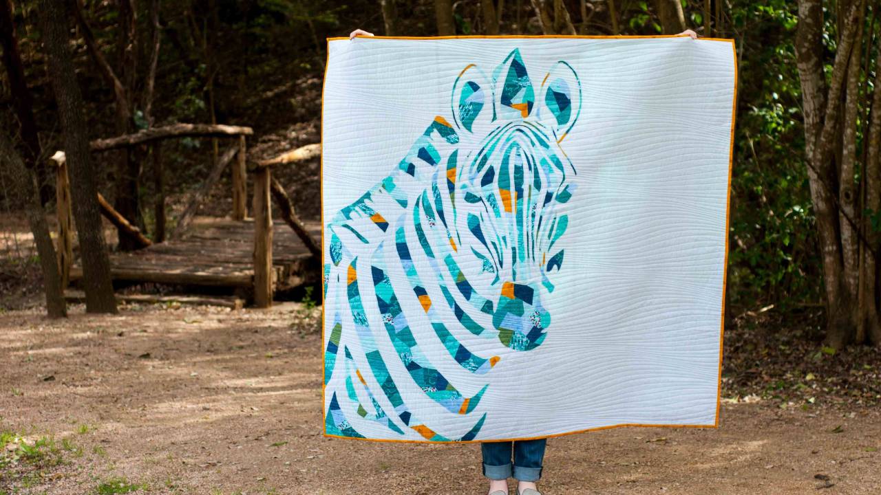
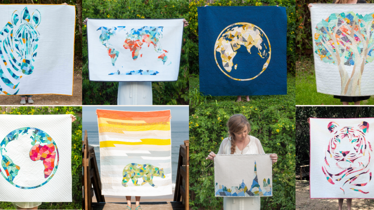

Responses