

Have you ever laid out a pull of fabrics you love — every single one of them beautiful on its own — and had them just sit there on the table, not talking to each other? They don't pop. Something's off. And the worst part is you can't say what, so you can't fix it. I want to give you the word for that today. It isn't the colors, and it isn't your eye. It's one thing, it has a name, and once you can see it you'll spot it in ten seconds flat. The fastest way to get it right is to know your season — so if you haven't found yours yet, start here. [Take the Color Season Quiz]
"What goes with green?"
If you've ever typed that into a search bar, asked it at the cutting counter, or texted a photo of your pull to your daughter for a verdict, this post is for you.
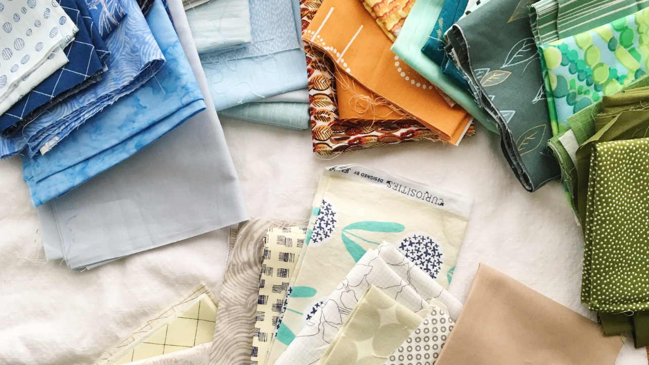
Because here's what usually happens next. You find a green you love, and an orange you love, and a soft yellow you love, and you lay them out together on the table... and they just sit there. Beautiful fabrics that don't work together. They don't pop. Something's off, and you can't name what.
So you assume it's the combination. Green and orange must not go together. Or maybe it's you — maybe you just don't have the eye.
I want to gently take that story away from you, because it's not true. So here's the thing:
Any hue can go with any other hue.
Green with orange. Purple with copper. Pink with olive. Navy with mustard. There is no forbidden pairing, no color that's "hard to work with," no chart you missed in some class everyone else took. Every hue on the wheel can live happily next to every other hue.
There's just one caveat, and it's the whole ballgame.
The caveat: the tones have to agree
When two fabrics fight, nine times out of ten it isn't the hues that are fighting. It's the tones.
Tone is simply how bright or how muted a color is. That's it. A clear, sunny lemon yellow and a soft, dusty, buttery yellow are the same hue — yellow — in two completely different tones. One is turned all the way up. The other is turned way down, like someone stirred a little grey into it.
Tone is about bright versus muted, and that's the part that needs to agree.
Here's why this matters so much. Bright colors want to live with bright colors. Muted colors want to live with muted colors. Put one clear, bright fabric in a pull of soft, dusty ones and it will shout over everyone. Put one muted fabric in a pull of brights and it looks tired and dirty, even if it's the loveliest fabric on the shelf.
The fabric isn't wrong. It's just from a different family.
The four tonal families (you already know their names)
If you've been around here the last few weeks, you've met the color seasons. Here's what they actually are underneath the pretty names: they're four tonal families.
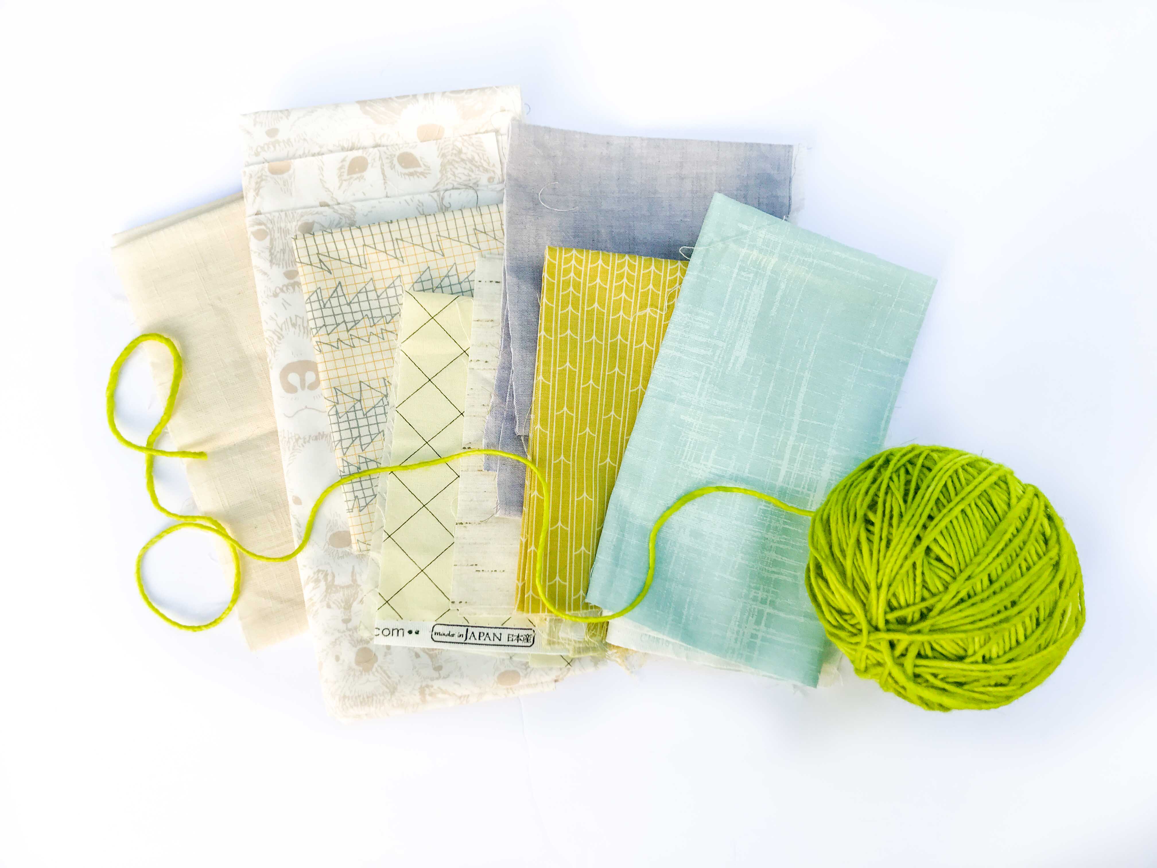
Spring is light and clear — bright, but soft. Fresh daffodils, new leaves, Easter eggs.
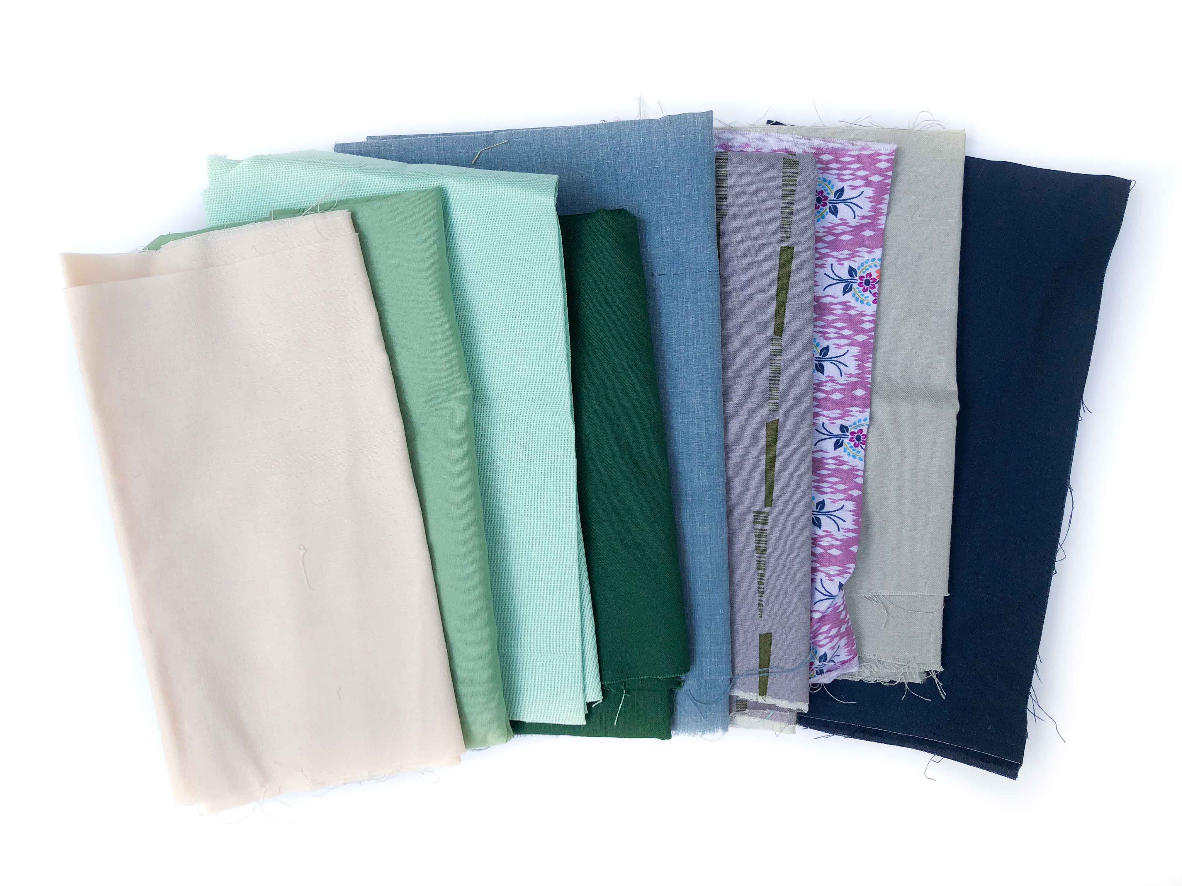
Summer is soft and muted — gentle, hazy, dusty. Lavender, sage, a faded blush.
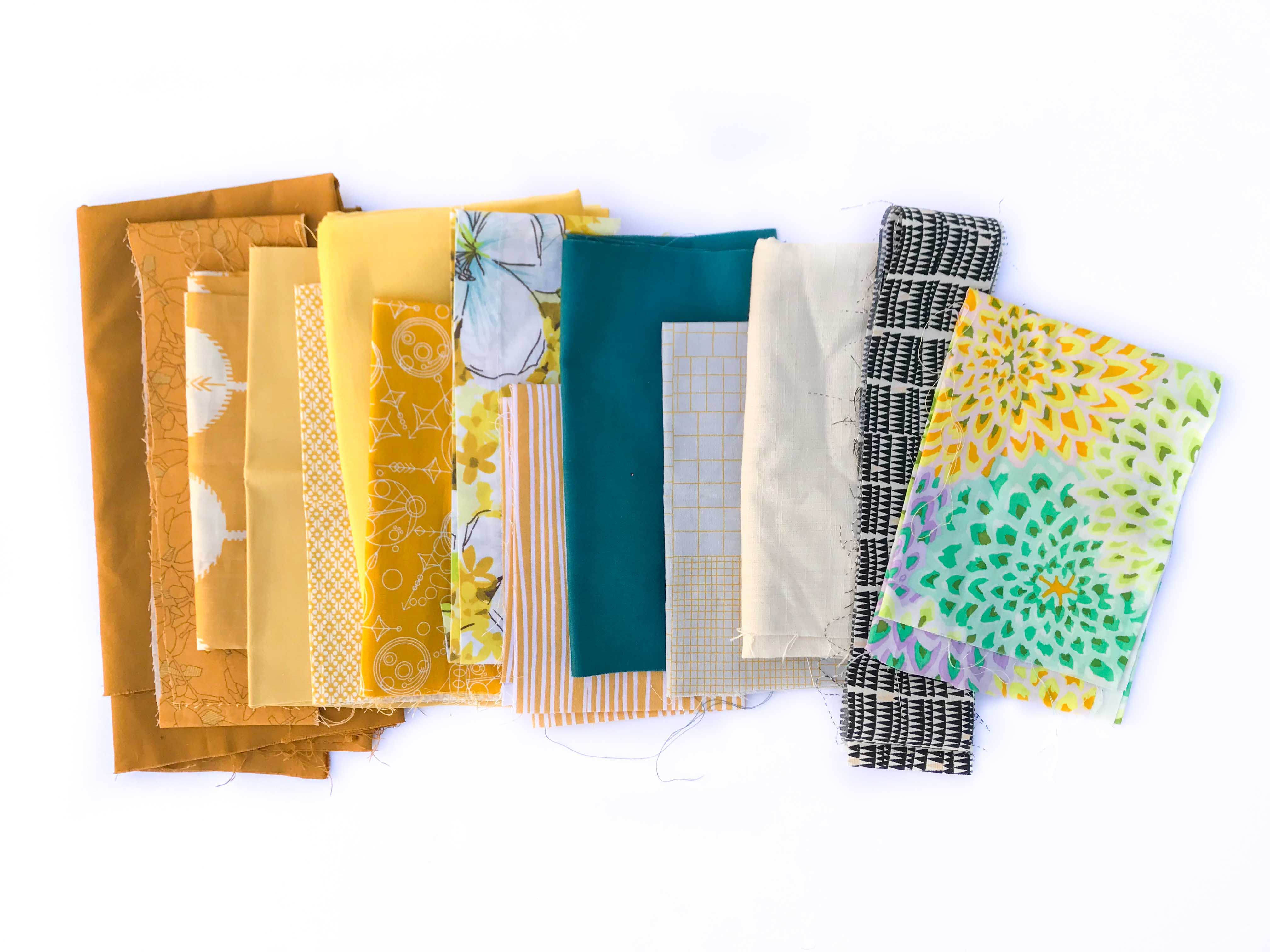
Autumn is rich and muted — deep and warm, but never shrill. Pumpkin, cinnamon, olive, rust.
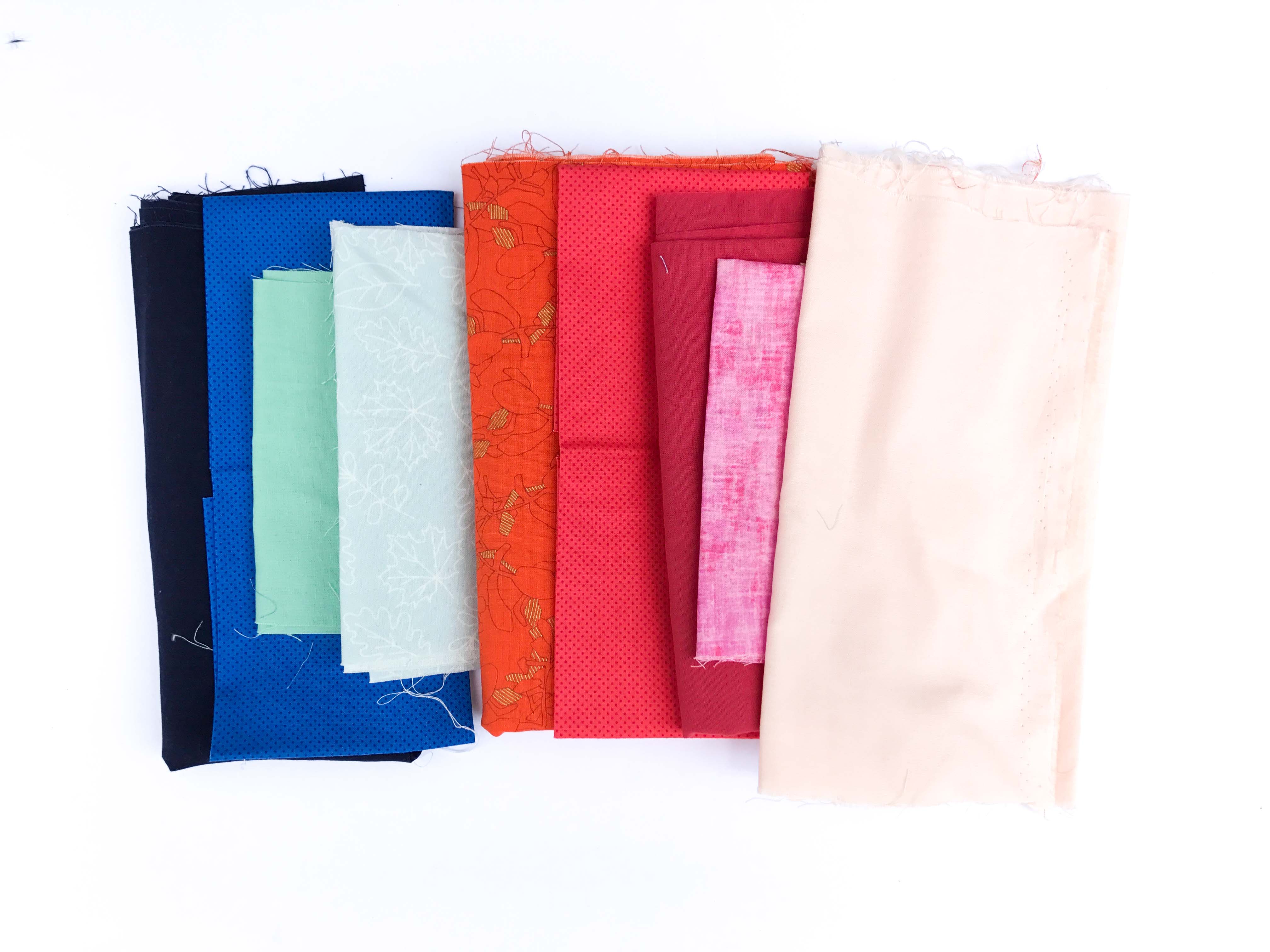
Winter is intense and clear — the brightest brights and the deepest darks, crisp as ice. Neon pink, cobalt, true black.
Every hue exists in all four families. There's a Spring green, a Summer green, an Autumn green, and a Winter green. Same hue, four tones. And the fabrics inside one family get along, almost no matter which hues you pick — because the tones already agree.
"I had a yellow, but it wasn't bright enough"
A quilter in one of my classes this summer described her problem exactly like this: "I had a yellow, but it isn't bright enough, or it's too orange to go with the other fabrics."
I love this question because it holds the whole answer. She had the right hue. Yellow was a great choice for her quilt. But her yellow was from a different season than everything else on the table — a soft Summer yellow trying to hang out with a pile of clear Winter brights. Of course it looked dull next to them. It wasn't the yellow's fault, and it wasn't hers.
She didn't need a different color. She needed the same color in the right tone. A Winter yellow — clear, lemony, turned all the way up — would have slid right into that pull like it had always belonged there.
That's the shift. The question was never "what goes with green?" The question is "which green?"
The shortcut
So here's what I'd love for you to do the next time you're standing in front of your stash:
Stop auditioning hues, and start checking tones. Are these all bright and clear? Are they all soft and muted? If they're all from the same family, you can pull green and orange and pink and mustard together and it will work. If one of them is from a different family, that's your "something's off," and now you can name it.
And the fastest way to know your family is to know your season.
Your season is the corner of the stash you keep reaching for — the tone your eye already loves. Once you know it, every hue inside it is fair game. You get a whole rainbow to play in, and it all agrees with itself. Pulls stop being an audition and start being a choice.
(There's more to this, of course — how to mix families on purpose, how to nudge a color brighter or softer so it fits, what to do with neutrals. That's the deeper work we do together inside my world. For now, one season is plenty of rainbow.)
Find your season
If you haven't discovered yours yet, I made you a quiz. It takes a couple of minutes — you'll look at palettes, quilts, and colors and pick your favorites, gut only, no overthinking. At the end you'll have your season, and the next time a pull isn't working, you'll know exactly which question to ask.
Take the Color Season Quiz here.
It was never the green. It was the tone. And that, you can learn!



Responses