
I made you something — and I've been so excited to share it.
Have you ever stood in front of your stash — or in the middle of a quilt shop — holding two fabrics that you love individually, wondering why they look terrible together?
You start second-guessing. You pull more bolts. You put them back. Maybe you text a photo to a friend for a verdict, because you don't quite trust your own eye. And somewhere in the back of your mind there's that little voice: everyone else just seems to know. Why don't I?
So here's the thing I want you to hear today: there is nothing wrong with your eye. Nobody ever taught you this — that's all. An eye for color can absolutely be learned, and it starts somewhere really fun: discovering what you already love.
Because your color preferences aren't random. They have a pattern. And that pattern has a name.
The four color seasons
Over years of teaching color to quilters all over the world, I've found that most of us are drawn to one of four broad families of color — and they map beautifully onto the four seasons of the year. Each season is like a little color formula: as long as the fabrics in your palette belong to the same season, they'll play together happily, almost no matter which colors you choose.
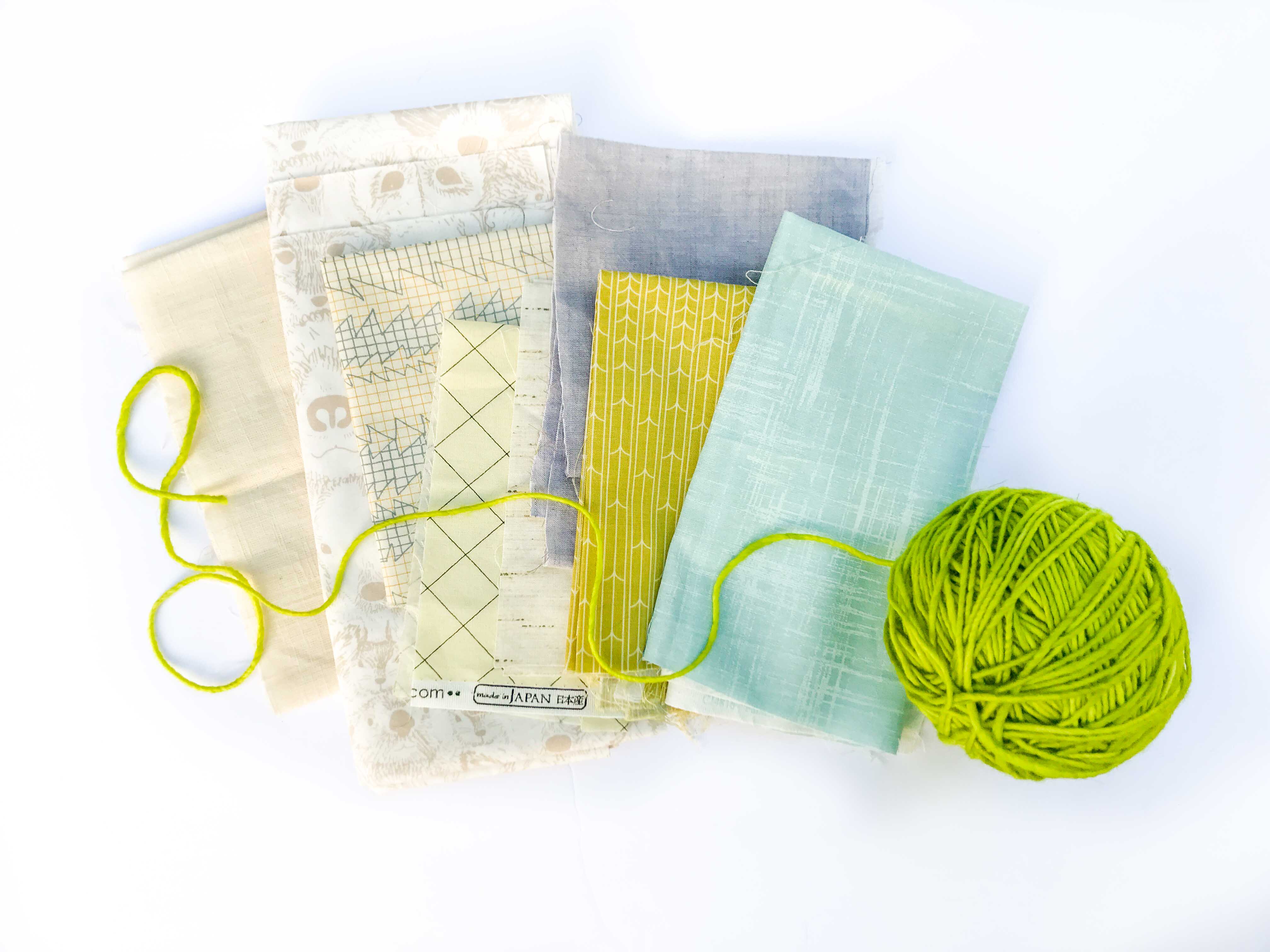
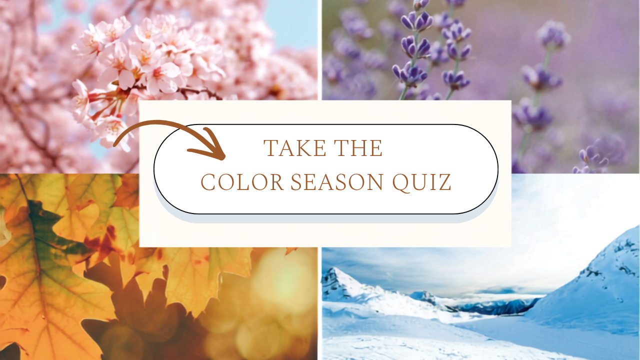
Spring is that burst of life after a long winter — the first daffodils, cherry blossoms, Easter eggs, that fresh new-leaf green. Spring palettes are light, bright, and clear, with a warmth to them. Happy, unfussy, playful. Spring doesn't take itself too seriously.
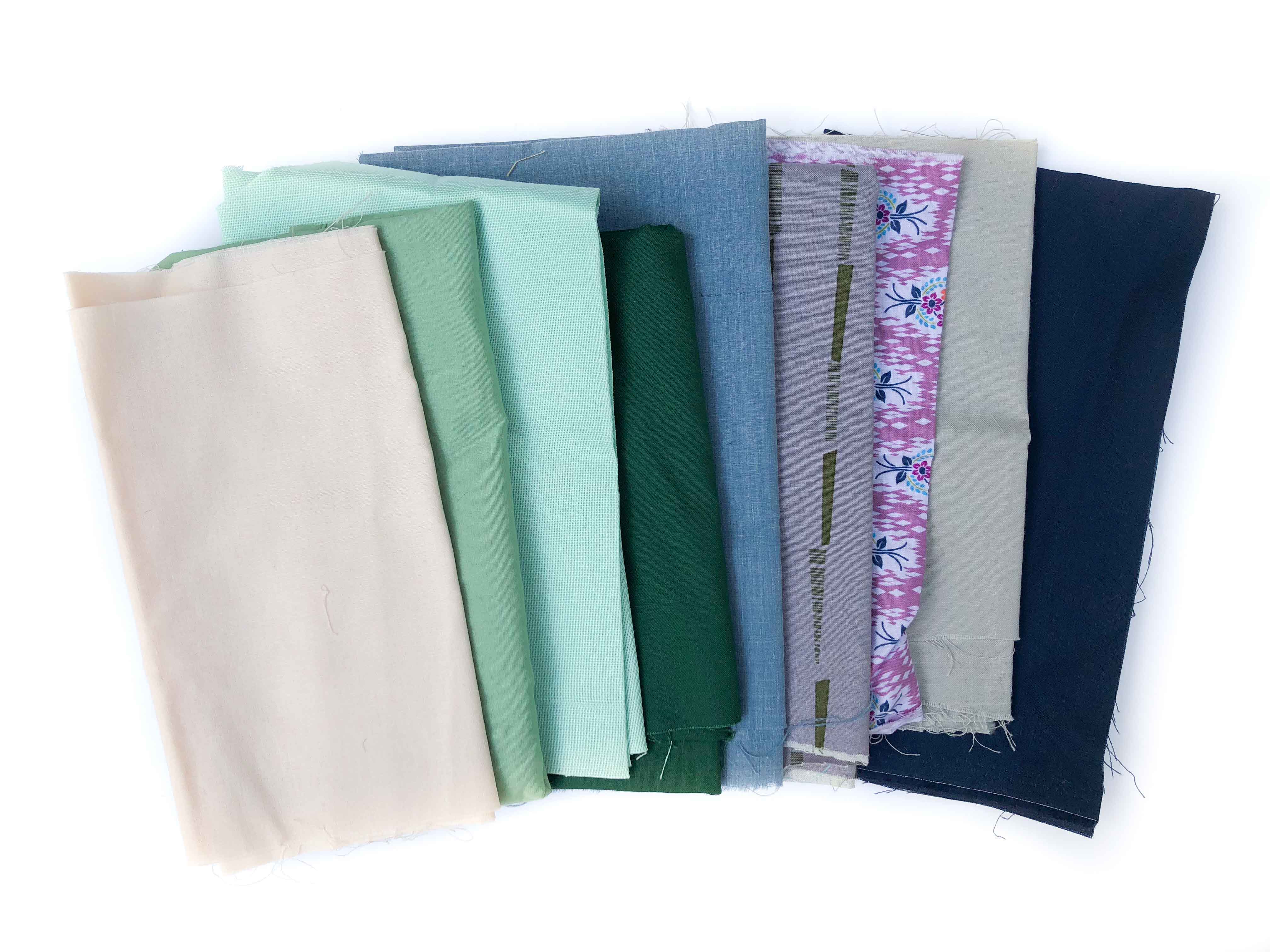
Summer is lazy, hazy summer days — an English garden, lavender and sage, a soft blush pink. Summer palettes are light like Spring, but much softer and more muted. There's a delicacy to them, a quiet elegance. Think of an heirloom wedding, or the sea through morning haze.
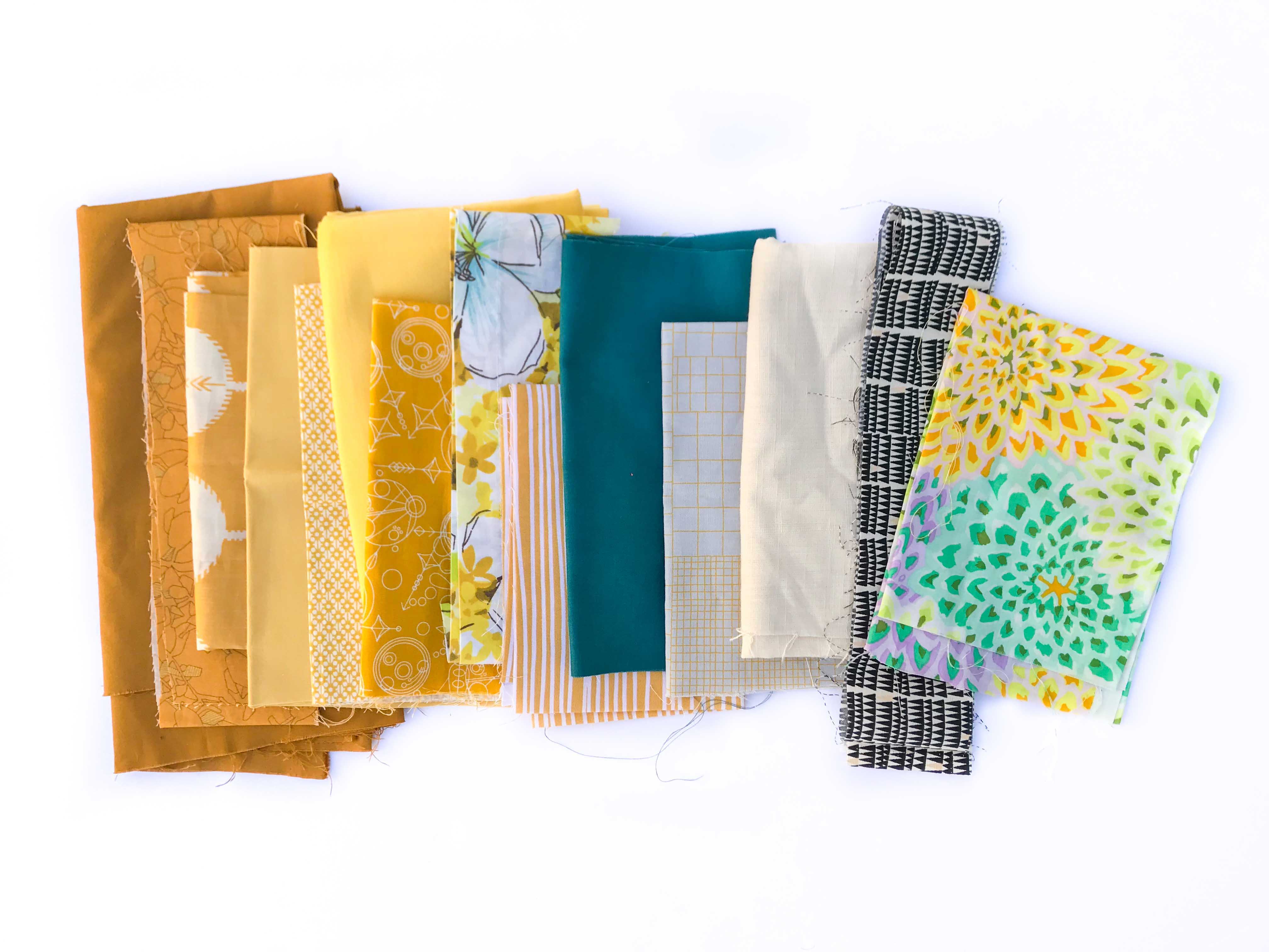
Autumn is fall leaves, pumpkin, cinnamon, straw. Autumn palettes are rich, warm, and earthy — still muted like Summer, but with much more intensity and fire. This is the coziest of the palettes, and it glows.
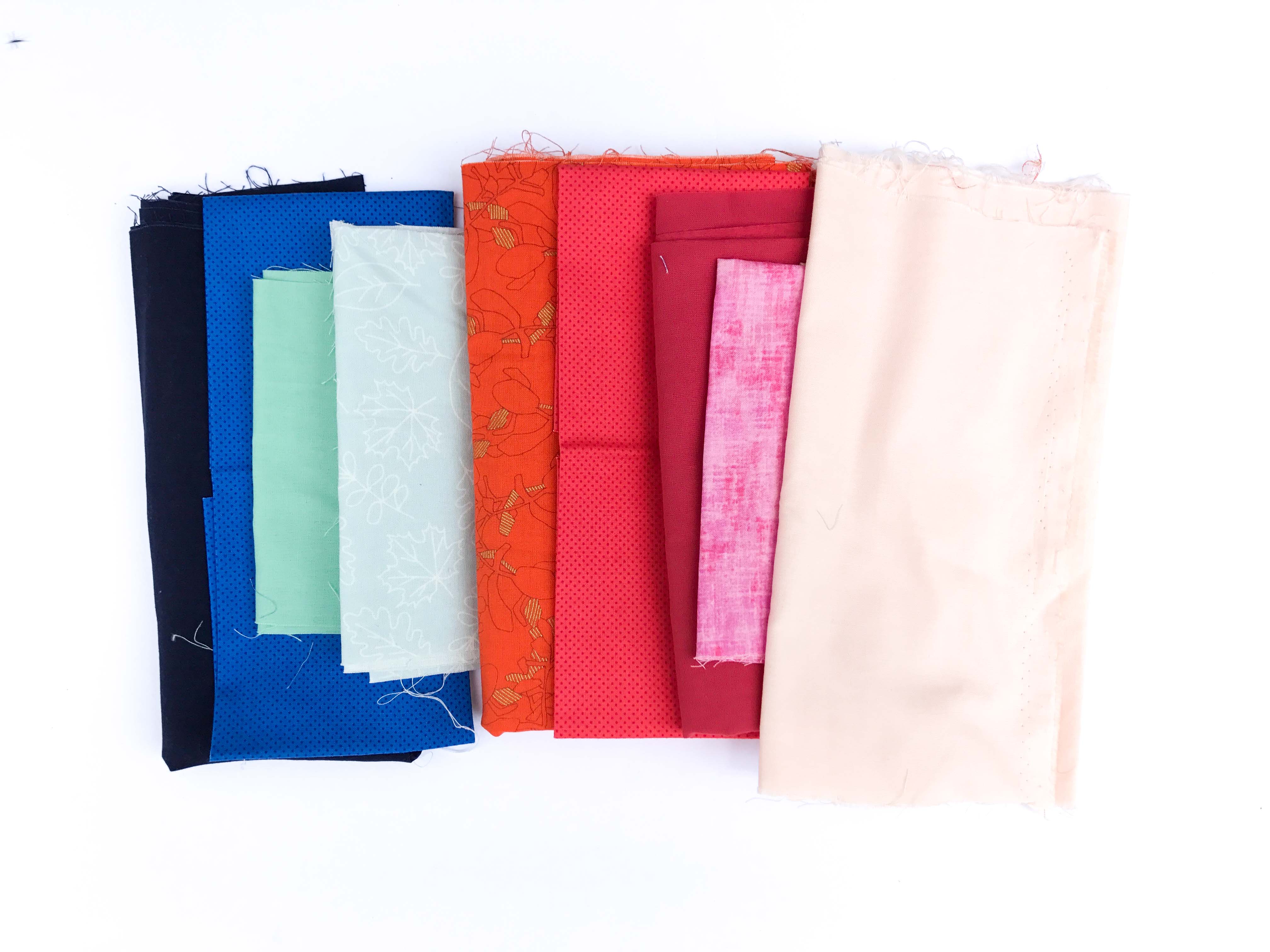
Winter is all about extremes — an icy blue landscape, metallic gold, neon pink, a bold black. Winter palettes are intense, cool, and crystal clear. This is where the brightest brights live. There's an opulence to Winter, a boldness. (Fun fact: black looks its very best in a Winter palette — it can feel harsh in the others.)
Why knowing your season changes everything
Once you know your season, so much starts making sense—why certain fabric combinations never felt quite right, why you reach for the same corner of your stash, and why some quilts stop you mid-scroll.
Your next fabric pull gets easier, too. Instead of guessing, you have a compass: Is this fabric in my season?
Your season is also part of something bigger—your style. The colors you love aren’t a coincidence; they’re part of how you see the world and the work you’re meant to make.
So... which one are you?
I made you something fun: the Color Season Quiz. It takes just a few minutes — you'll look at palettes, quilts, and colors and simply pick your favorites, gut instinct only, no overthinking allowed. At the end, you'll get your color season, and you'll start seeing your stash (and honestly, your wardrobe and your house) with new eyes.
Take the Color Season Quiz here!
Then come tell me on Instagram or Facebook — which season did you get? And did it surprise you, or did it feel like coming home?


Responses