
Since the Color Season Quiz went out last week, my inbox and comments have been an absolute delight — so many of you sharing your seasons, comparing results with friends, seeing your stash with new eyes. I love it. Truly, this is my favorite kind of mail.
And there's one question coming up more than any other. It sounds like this:
"I got winter... but I was SO close to spring." "I'm a summer leaning autumn — is that allowed?" "Honestly, I love colors from a couple of different seasons. Is something wrong with my eye?"
Oh, friend. Nothing is wrong with your eye. Something is right with it. Let me explain.
The seasons are neighbors, not boxes
Here's the thing: the four color seasons aren't four separate boxes with walls between them. They're more like... the actual seasons. The year doesn't snap from winter to spring at midnight on the equinox — there's that in-between stretch where the snowdrops and crocuses are just poking up, the light is changing, and you can feel both seasons at once. (That's my favorite time of year, for the record. Those little harbingers of spring make me ridiculously happy.)
Color works the same way. Every season shares a family trait with its neighbors — and if you fall between two seasons, that shared trait is exactly what your eye is drawn to. Look:
Spring + Summer share softness and light. If you land between these two, you're probably drawn to gentle, airy palettes — the difference is only how bright or muted you like them.
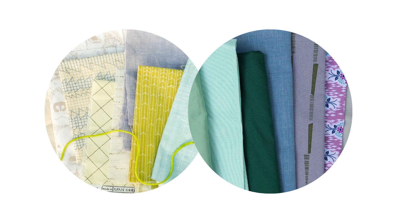
Summer + Autumn share mutedness. If this is you, you love colors that are toned down and quiet — sometimes cooler and more delicate (Summer), sometimes warmer and richer (Autumn).
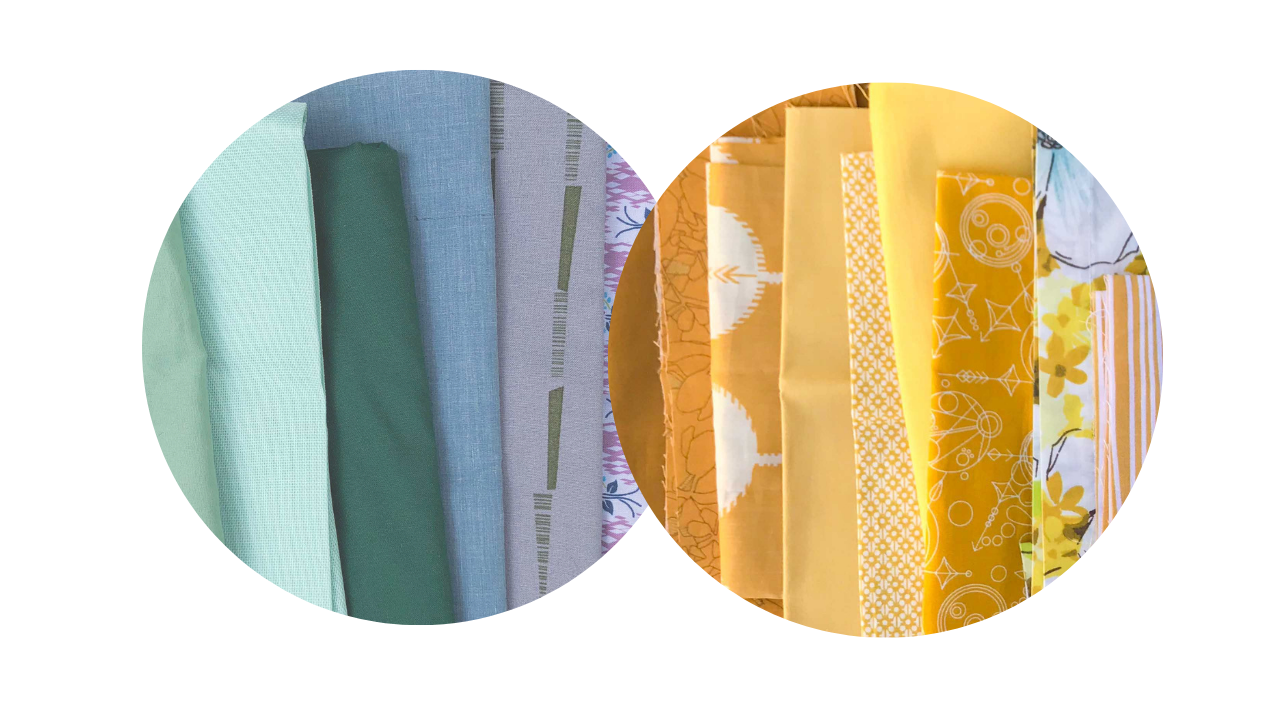
Autumn + Winter share intensity. This is that windy late-fall moment when things get rich and dramatic. If you're here, you love colors with presence and depth — bold, substantial, a little moody.
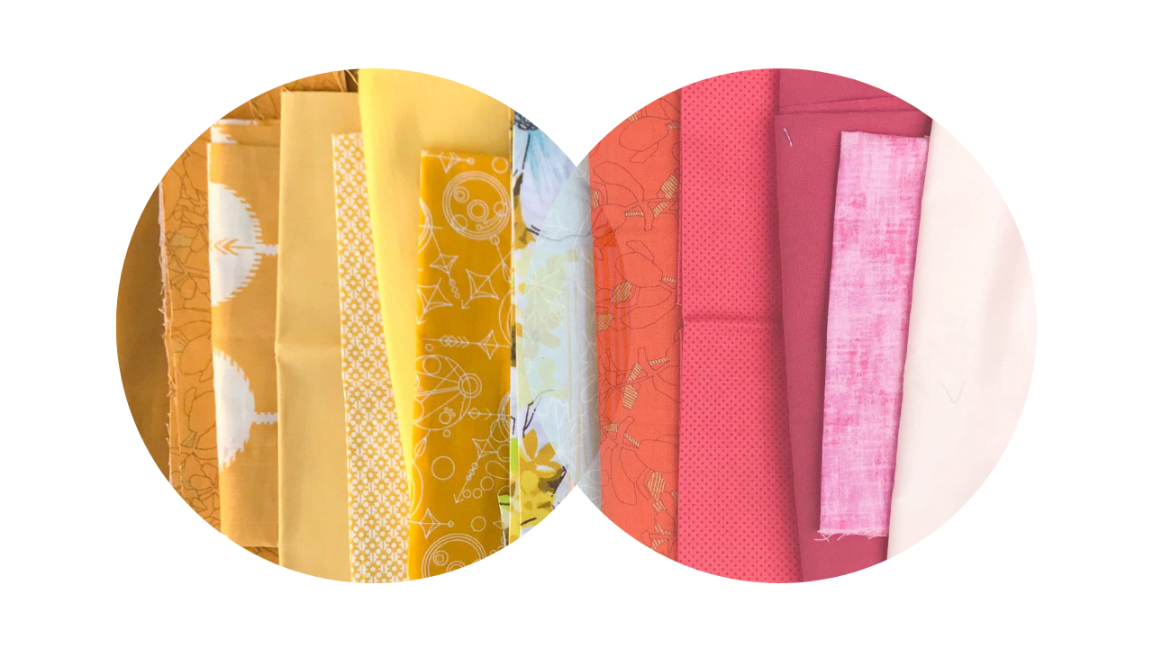
Winter + Spring share crispness — clear, bright color with nothing muted about it. Icy brights melting into fresh pastels, like the first crocuses against the last snow. If this is you, muted palettes probably leave you cold, whether they're light or dark.
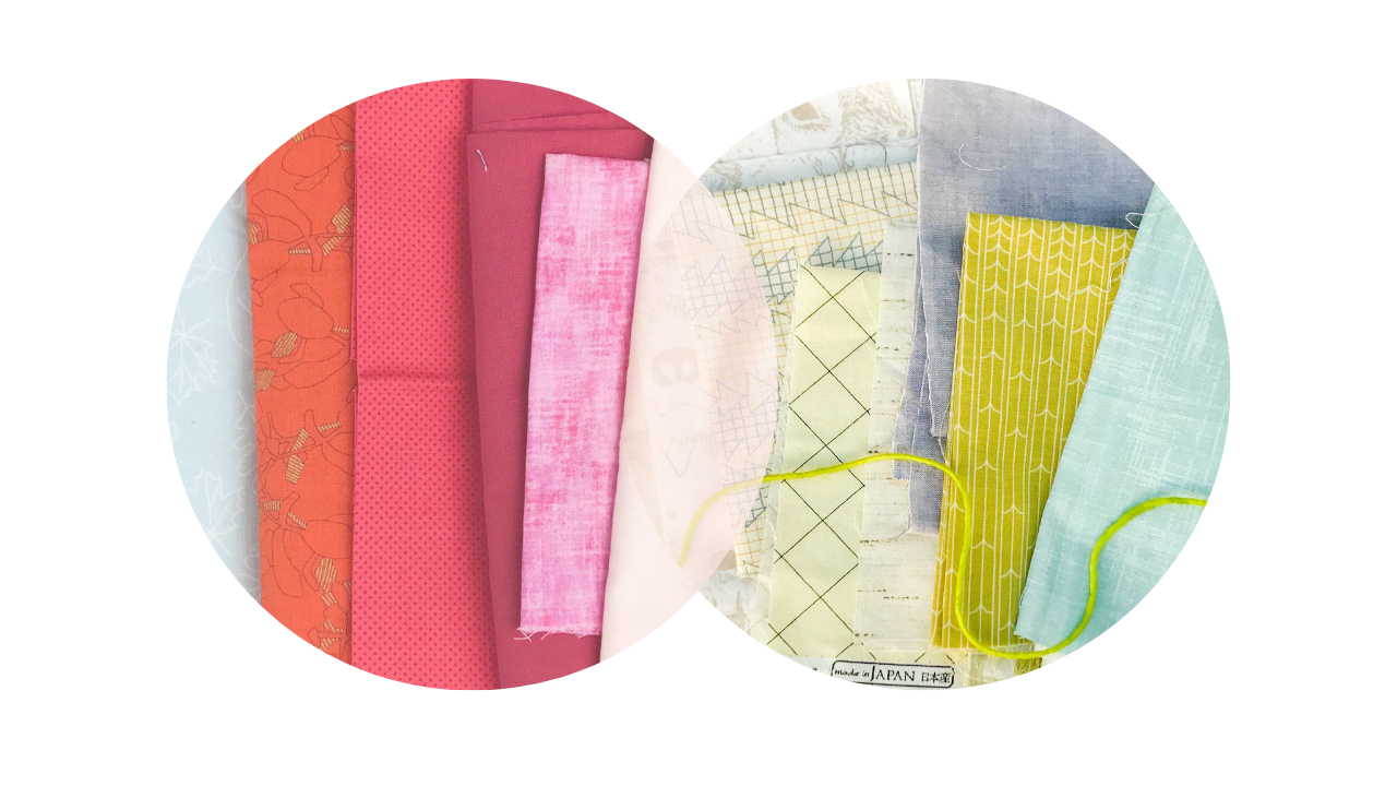
So "I'm a summer leaning autumn" isn't a glitch in your results. It's a more precise description of your style than either season alone. You're not between homes — you know exactly what you love: muted. That's real information, and it will guide a thousand fabric pulls.
Can you mix seasons in one quilt?
Short answer: yes! Neighboring seasons — the ones that share a trait — pair together beautifully, precisely because of what they have in common. A Spring-Winter palette can be stunning: all that crisp, clear color, ranging from light to intense
That's the deeper work we do together in my world — for now, just know that your in-between-ness isn't a limitation. It's the beginning of fluency.
Haven't met your season yet?
If you haven't taken the Color Season Quiz, this is your invitation — especially now that you know that landing between seasons is one of the most interesting results you can get.
And if you have taken it — tell me in the comments on Instagram or Facebook: are you squarely one season, or do you live in an in-between? I'm an Autumn leaning into Winter myself!



Responses