
One of the most overlooked secrets behind a beautiful quilt—especially a collage quilt—isn’t the pattern or technique.
It’s the fabric palette.
The types of prints you choose will dramatically affect the texture, depth, and personality of your finished piece.
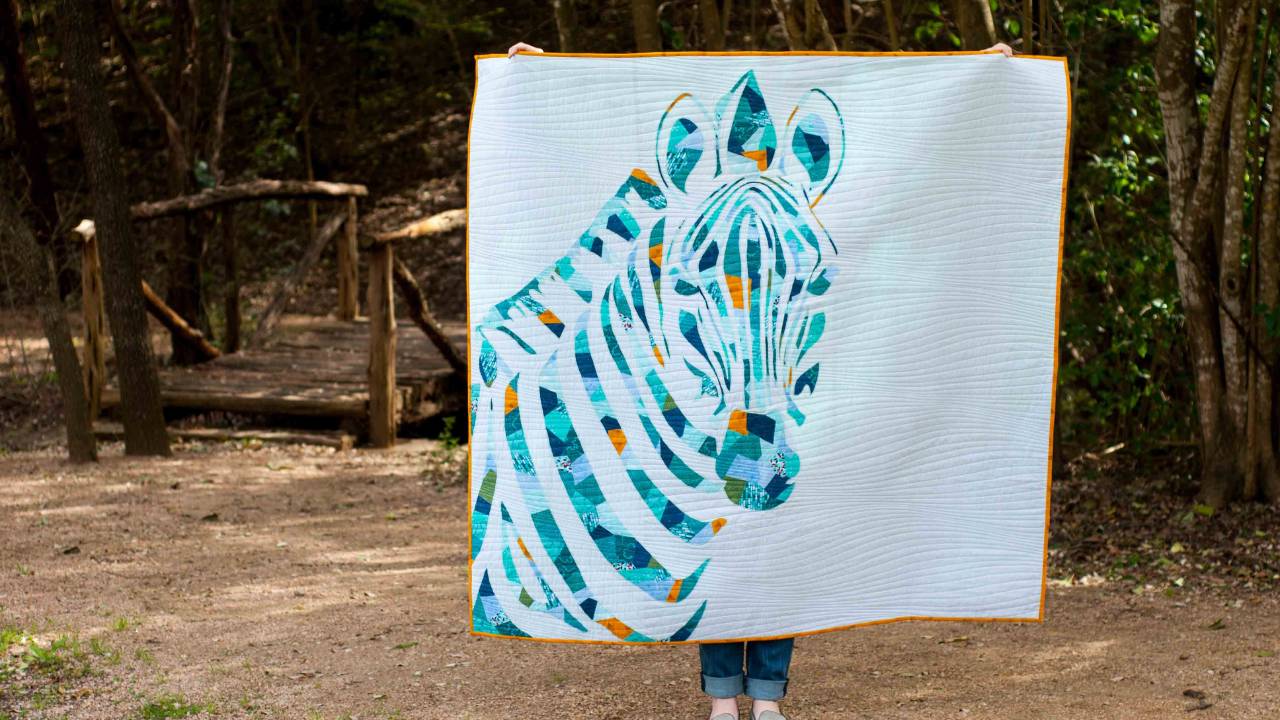
That’s the magic of Scrappy Appliqué: texture made entirely from fabric.
And how you select those fabrics can elevate your quilt from lovely to jaw-dropping.
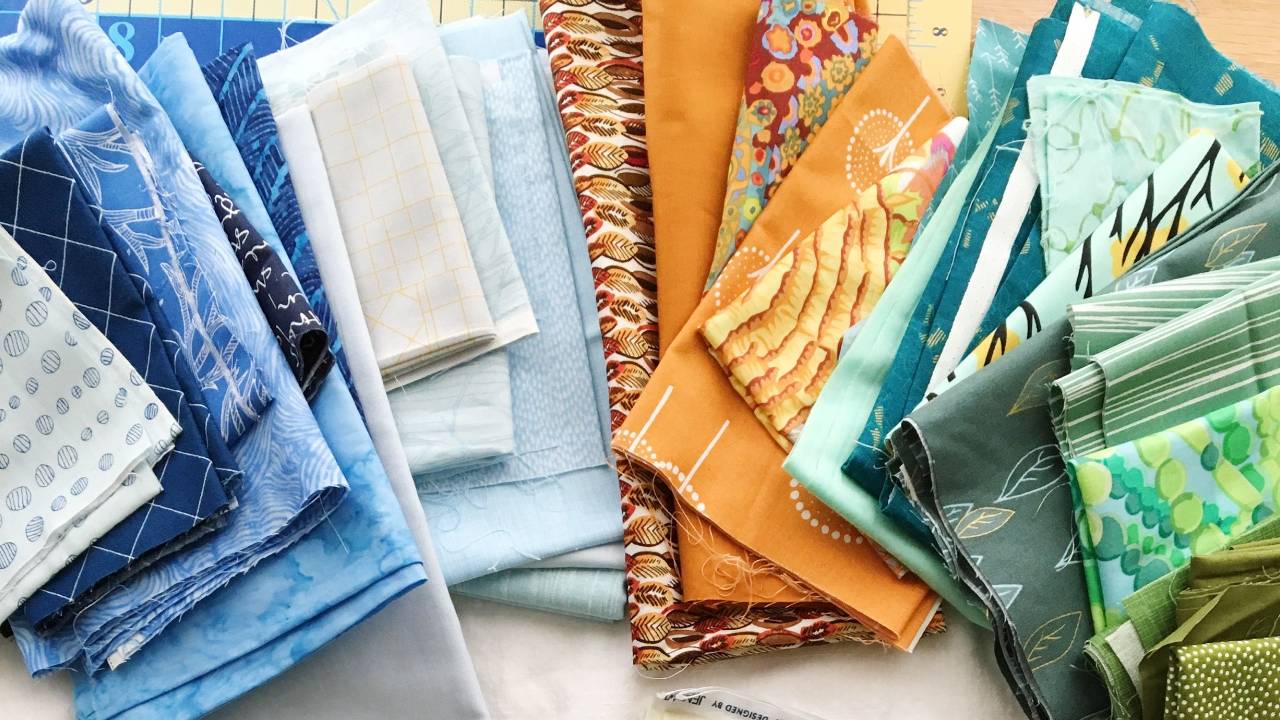
Here’s a peek into the fabric formula I return to again and again:

✨ Solids (1-3)
Pure blocks of color. No texture added.
They give your eye a place to rest—essential in a busy collage.
✨ Textured Solids (2-3)
Subtle texture, big payoff. Think chambray, shot cotton, linen, or hand-dyed fabrics.
Perfect for filling out your collage with softness and movement.
✨ Monochromatic Prints (3-5)
Prints made from one main color (tone-on-tones or blenders).
These are the unsung heroes—lots of interest without stealing the spotlight.
✨ Multi-Colored Prints (1-2)
They grab attention and bring energy.
Use deliberately. I love finding one bold print that echoes the collage’s palette and adds a pop.
✨ Prints with a White Background (0-1)
These are eye-catchers. Use sparingly to keep your collage cohesive, or intentionally for a softer, scrappier look.

I’ve spent years testing and teaching this fabric strategy—and now, I want to show you exactly how I use it to create bold, personal collage quilts.
That’s why, for the first time in years, I’m offering the Scrappy Appliqué Workshop as a standalone experience.
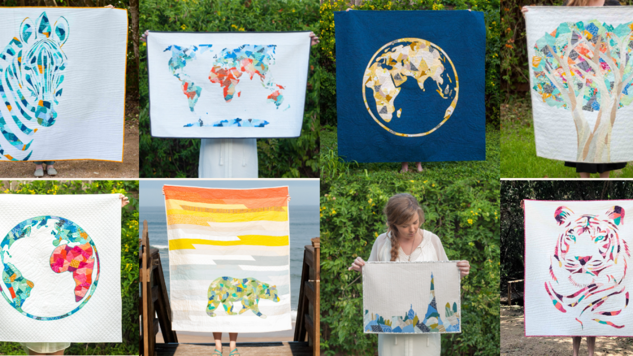
And when you join now, you’ll also receive a bonus pattern bundle—a curated collection of some of my most popular Scrappy Appliqué designs to help you dive in and start making right away.
Explore the Workshop + Free Pattern Bundle
It’s the most joyful way to play with color, trust your instincts, and make something unmistakably you.
Happy stitching,
Shannon
PS – This is the only time this year you’ll be able to get the Scrappy Appliqué Workshop as a standalone class plus the bonus pattern bundle. If you’ve been wanting to try it, now’s the moment. Grab it here!

Responses